
Theming
HyprPanel is built with theming in mind. It's extremely easy to change the look of your panel and context menus with just a few clicks.
Every element that you can see on the panel is themeable. This includes the background, foreground, icons, text, and context menus, context menu items, and more.
The theming settings can be found in the Theming section of the settings dialog.
This section is divided into the categories listed below.
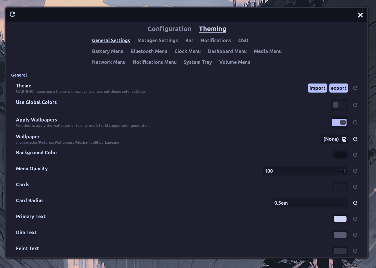
General Settings
The general settings section allows you to configure the generic context menu components of the panel. Additionally, from this section, you can import themes from the themes directory.
Matugen Settings
The Matugen Settings section allows you to enable wallpaper based theming. This feature allows you to set a wallpaper and have the panel colors adapt to the wallpaper colors. For this feature to work, you need to have a wallpaper set in the General Settings section. The wallpaper doesn't have to be enabled but it must be set to generate the appropriate colors.
This section contains the following settings:
Enable Matugen
Enables or disables the Matugen feature. You must have the matugen dependency installed for this feature to work.
Matugen Theme
Lets you choose between the light and dark theme generated from the wallpaper.
Matugen Scheme
This lets you choose between the different variants of the palette generated from the wallpaper by Matugen.
Matugen Variation
This is a list of handpicked variations of the generated palette. You can choose between these variations to get the desired look.
Contrast
The contrast setting allows you to set the contrast of the generated palette. This setting is useful when the generated palette is too bright or too dark.
Bar
The bar section allows you to configure the panel's background, foreground, and text color.
All the colors of each module in the bar can be configured from this section.
Button Styles
There are 4 different button styles available for the buttons in the bar. You can choose from the following styles:
Default
 The default style allows you to set a background color for the button. The icon and the label both share the same background color. You can however set a different text color for each.
Split

Split style allows you to split the button into two parts. The left part is the icon, and the right part is the text. In this style you can assign a background color to each individual button's icon section to achieve a style like the one shown above.
Wave
 The wave style is similar to the default style with the exception of the wave shape of the buttons. The configurations are the same as the default style.
Wave 2
 The wave 2 style is similar to the wave style, except with the shape in the reverse direction.
Notifications
The style of the notifications toast can be configured in this section.
OSD
You can configure the style of the on-screen display pop-ups in this section.
Context Menus
The rest of the sections in the Theming dialog allow you to configure the context menus and context menu items. The context menus and their contents can be configured to have different colors and styles.